'It's getting people to be complicit in the suspension of disbelief. What if this were true? How would you respond to it?'

Architect Brian Garrison on seeking myths and magic to inspire the theatre of retail design
8 minute read / Rosanna Vitiello
Brian Garrison builds stories as skilfully as he builds places. An anthropologist turned architect, Brian’s gaze flips between the cultural and physical dimensions of space, seeking myth, legend and cultural traces to divine the spirit of place. It’s this flair for reinterpreting both fact and folklore that has inspired the design of stages for storytelling of epic proportions. From the energy of East Coast stadia to the theatrics of Shanghai retail, Brian and his design team at Value Retail have flexed this way of thinking to dream and construct some of the world’s most successful retail environments. But for Brian, it always starts with imagination. "And that's what storytelling's all about, right? You try to communicate and pass on the tradition and you do it with your own take and spin on the interpretation.” So we meet on a flying visit to London to find out how stories bind people to place and how to design the folklore of the future.
Brian at the Art Deco inspired Beaumont Hotel, London
Brian, you’re a New Yorker — and we’ve found that New Yorkers are often natural born storytellers. How do you think your background has influenced the way you now use narrative?
Well, you know New York is a city that was settled by immigrants. Everyone who lives there came from somewhere else — including my own family who came from Eastern Europe in the late 19th century. And of course, they brought a lot of stories with them.
A lot of these immigrants, particularly in our family, were escaping religious persecution or socio-political oppression, and so the stories they brought with them weren't always happy. But the stories provided ways of remembering what they were forced to give up, how they survived and what they were striving for. I think it’s what helped them to establish their roots in the city and to create a sense of community.
It’s why I still think New York is one of the greatest cities in the world, because it has that. It's incredibly unique.
“For me, New York is a compilation of millions of stories.”
It’s also a challenging environment: it's rough and tumble, it's fast-moving. Having lived in Europe for the past 26 years, and now in the process of moving back there, I'm constantly reminded of how intense it is! But it's also provocative. You must draw from your sources of energy and novelty and experience to engage with it.
You’re also trained as an architect. How did you develop your sense of narrative in your work?
Before I did architecture, I was an anthropologist. My first degree was in Anthropology and South Asian studies, and I worked at the Museum of Natural History of New York.
“Anthropology considers how stories bind people to their place, and how the evolution of community is formed by legends, folklore and stories.”
My area of focus was India; I've spent a lot of time there. If you take a village, for example, and look at the paths that defined the tracks of the village, there are always stories behind why you go this way to avoid this tree, or why you go that way to avoid a snake’s nest. These are the things that are passed down through generations.
I spent a year working for an architect in India, based at the School of Architecture in Ahmedabad. Ahmedabad has a unique building form called a ‘pol’: a district that’s a composition of different houses with a certain type of window and balcony. The different ‘pol houses’ come together to form community nodes.
The shape of these spaces help children understand what their boundaries are. When you were a small child, you knew that you could play within a certain area and you would always be watched over by your family or your neighbours. As the child gets older, they knew that they could venture a bit further out but still have the protection of this community. At the very end, the boundaries expand even further: for the children who wanted to go on to higher education, the community often bands together to create ‘education banks’, which would help families who didn't have the means to be able to provide higher education for their children.
So, there's something interesting about how the form of the village shapes the sense of community and supports the social structure. That, for me, was the transition from anthropology into architecture, planning and urban design. You see other examples in planned communities — whether it's the garden communities created by Ebenezer Howard in the UK, or in experiments with New Urbanism in the US.
When you’re creating new developments in places where there's not a lot already there, how do you go about looking for the story?
A lot of our sites have been on the edge of town, or way out of town, where there's little physical or even cultural context.
So, we start by talking to people, trying to find what are those legends or myths within the community that might inform a conceptual direction.
One example is a project [developed by Value Retail] in Fidenza, Italy, where the site had no real topographical context of any merit, and certainly no architectural context. The site is out on the edge of the autostrada, and the town of Fidenza itself is some kilometres away.
I had gotten to know the mayor of the town, and I asked him, "What do you think we should do? What's the attitude we should take?" We originally had an idea of a vernacular Italian village. He said, "Don't do that. We have so many wonderful villages in this area of Italy. You wouldn't have the budget to recreate it properly and it would be a complete failure." He said, "For us, this area is about passion. It's about food, it's about music. Conceive a project that touches on that and then we'll talk."
I went away thinking, how do you create a physical environment that's about passion and music? What was interesting is that Giuseppe Verdi grew up in a hamlet that was part of Fidenza. The legacy of opera in Fidenza was sophisticated; the community knew everything about opera. You could talk to almost anyone and they could tell you the plots of every Verdi opera. That became the beginning of the thread that we wanted to explore.
The other hook was filmmaking. I knew that Lucchino Visconti, the film director, was born and grew up just a few kilometres away, near Piacenza. He had taken over his family estate there and created a back lot for films that he produced in the '50s and ‘60s with Sophia Loren and so on. It was his interpretation of this Italian town that could be completely malleable - very much like the back lot in Hollywood.
So, I said, let's try to put these together: a combination of music, opera, and filmmaking.
Above — Grazzano, Visconti's family estate
How did you develop that narrative into physical architecture and landscaping?
We created a storyline that would give some intellectual armature to design the buildings around. I've always been a big opera fan, so I found two obscure Verdi operas and did a mash-up of their respective plots. It was a Cain and Abel story, about two brothers, who were rivals for the affection of their father under the shadow of the madness of their mother. We imagined that this family was of the nobility, with an estate developed maybe in the early 18th century - and that was the beginning of our project.
We started to draw out what this might look like, taking the actual site parameters and thinking about what would have been on the estate as it evolved over decades. Formal gardens; a kitchen garden in the back; stables and barns for the horses and livestock; and so on. We thought that this estate would also evolve over time as generations moved on, and we created character types for the two brothers: one was an artist and aspiring filmmaker, and the other was a playboy. The second brother ended up having some control over the direction of this estate as it grew, and then the first brother - who had gone to the States - came back with a dream of creating cinematic interpretations of Verdi operas. In our story, that desire underpinned the design of the buildings: he decided to produce these films at the estate and convert some of the buildings and gardens into sound stages and outdoor film lots.
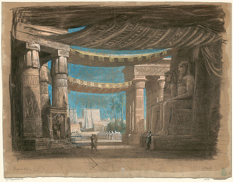
In the story, there’s a great fire, which ends in the partial destruction of the estate, which is “discovered” and re-constructed by Value Retail. So, it’s as if we found these remnants of the buildings. In our discovery, we found fragments of the sets that were used for Aida, Otello or Falstaff and others, and we restore them.
Sketches of Aida opera sets — inspiration for the design of Fidenza
Sketches of Aida opera sets — inspiration for the design of Fidenza
In all these stories, there are elements of truths that filled them out. Some of these are operas, as well as personal experiences of members of our design team. The narrative was ultimately about the celebration of creative energy, cast in the crucible of family conflict. Through the design approach, we reflected that conflict in the dialogue between background buildings and foreground buildings, elaborate facades and relatively simple facades, to ‘create’ the history of this place that had none before.
In all the projects we've done, some of the stories are more elaborate, some are less so. But all stories help us create a context and parameters that we can design within.
The worst thing you can do with a creative team is say, "Here's the blank canvas, do whatever you want." The more constraints you impose, the better outcome you get.
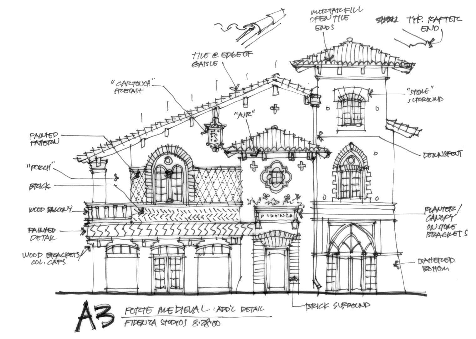
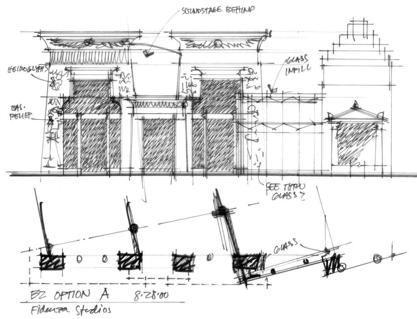
Original sketches of Fidenza Village
Are there any specific tools or techniques that you use to shape the story and the design?
“We almost always start by working with an illustrator rather than an architect. ”
With Fidenza, we started by illustrating what some of these sets might look like if there if there were a movie in production. Before we get to that, we do a referencing process of examining photographs, engravings and other graphic expression — whatever we can find, to pull together a library of inspiration.
We have adopted a principle that Walt Disney always used, which he coined a “weenie”. The weenie is a vertical element orients the guest in the space, and draws them from one spot to another. The Sleeping Beauty castle at every Disneyland is the ultimate. It's a point of orientation and a point of inspiration. We start out with the streets, networking the streets and the blocks together with a weenie, and then we create our postcard views.
“And then we start thinking, “What do we want that view to feel like?” Not what we want it to look like. Is it going to be dramatic? Is it going to be emotional? ”
Is it going to be humorous? Quirky? Only once we are happy with it, do we start looking at the architecture. We move from hand drawing to using a SketchUp model. I just learned that the company behind SketchUp, thinks that our SketchUp models are the best in the business because they are so detailed! It's worthwhile because we can use it as a real tool to get deep into the experience.
Fidenza Village — a combination of compression and release
How do you use the classic elements of storytelling to stimulate emotion? For instance, to create pace and surprise?
One of our biggest constraints is that we are creating retail projects which need to be efficient and productive for the shops and restaurants. We must be respectful about supporting retailers and what they need. Aspects of this are somewhat formulaic insofar that, for example, windows to need to represent a certain percentage of the elevation, they must be certain type and certain width; the lighting and signage are specific, and so on; so we work within these constraints.
We look at how we propel people through the experience, which is a combination of compression and release, like a pump. From large areas, you get people down to the narrower bits, and then the weenie draws you through. We also use decorative elements — paving, lighting, landscape — to help drive that progression through the experience.
We also know that you get to a certain point where you want to relax. That's achieved both in terms of creating a three-dimensional space and through the decorative elements on the buildings that encourage pauses and moments of respite and reflection.
Do you see a difference between your approach in your retail projects and your other types of projects, such as music and sports?
It's a good question — and one we are experimenting with right now. We’re currently working on an 18,000-seat arena that's designed for both music and for sports, as well as hotels and other activities. We have very different populations that these need to support at different times of the day. So, retail might have its peak between 10am and 4pm, but a music or sports event will be later in the day.
The attitude and the energy that people come with is also very different. Our arena is designed for a hockey team, and hockey fans are probably the most intense fans you'll ever find. Hockey is fast-moving and aggressive; these fans want to see gladiators in a forum! We need to support that, as well as people who are coming to the arena for the shopping experience, and for music, which is completely different again depending upon the act - whether it's hip-hop, rock, classical or folk.
With this project, we’re creating zones that are very distinct, but with an overall vision that holds it together. I don't know whether there's a storyline behind it yet, but we are working on creating a landscape where different things happen. It's a bit like A Midsummer Night's Dream: the development of the storyline is a bit like that enchanted forest. Watch this space! We're still figuring it out.
Shanghai Village
You've also worked all over the world, in different cultures. What have you learned from that?
People from different cultures respond to space differently. In China, people tend to walk around the perimeters of an open space. This is because it is believed that malevolent spirits can only travel in a straight line; you must create obstacles in a space so that they cannot affect you. Whereas Americans and Australians, for example, will walk right through the middle of the space. In southern Europe — say, in Spain and Italy — people feel very comfortable in more confined public spaces. Americans like broader spaces; they don't like that sense of compression.
These idiosyncrasies translate into our business. For example, in our Barcelona project, some of our highest sales densities — or level of sales per square metre — can be found in the narrowest part of the project. This is because people tend to socialise outdoors, rather than in their own homes, and so there's a lot of social interaction that makes people slow down, particularly when space is compressed. Inevitably those retail units at such points get more attention.
We also employ storytelling in how we communicate the values of our experience to guests. In China, the sensibility of avoiding straight lines goes back to mythology, and to principles of Feng Shui. For example, we have two stone mythological creatures that are literally buried in two locations in our Shanghai project, because in looking at how the ground water courses in this area, there was a risk that the evil spirits could follow these two courses to create bad luck for the project, unless there was an obstacle. So, the obstacle was this mythological pig-like animal we've carved out of stone and buried, with a ceremony, into the space. While most of our customers may not be aware of why this is happening, somehow innately they know that this is a safe place. It helps them to realise that, while we were creating something that is completely novel, we are being respectful of tradition. It also makes the place a bit more special and memorable.
Shanghai Village
Myths and stories do help to create a sense of connection to a place.
That's absolutely right. In all the storytelling that we've used over the years, we never say, “This actually is what happened”.
“It’s more about trying to get people to be complicit in the suspension of disbelief. I would call it a kind of “what if” scenario. What if this were true? How would you respond to it?”
To go back to the Fidenza example, this is a newly built project. It didn't exist in the early 18th century. None of it existed there. But we created this whole story that links back to Verdi, music, food, and a conversation with the mayor. We said, "Imagine that this story actually was true, and just play the game with us and have fun doing it."
One of my favourite aspects of this approach is that we don't overtly use the stories in marketing the projects, but the stories get told by members of our team over the years. It’s interesting for me to hear how they interpret the myths behind the projects. We've grown from five people to 1,300 people. I hear these stories being told and they're slightly different each time.
nd that's what storytelling's all about, right? You try to pass on the tradition, and you do it with your own spin.
Shanghai Village — The Croissette
How do you actually go about passing on the story on to somebody else? Whether that's to the guests or the people who are working there?
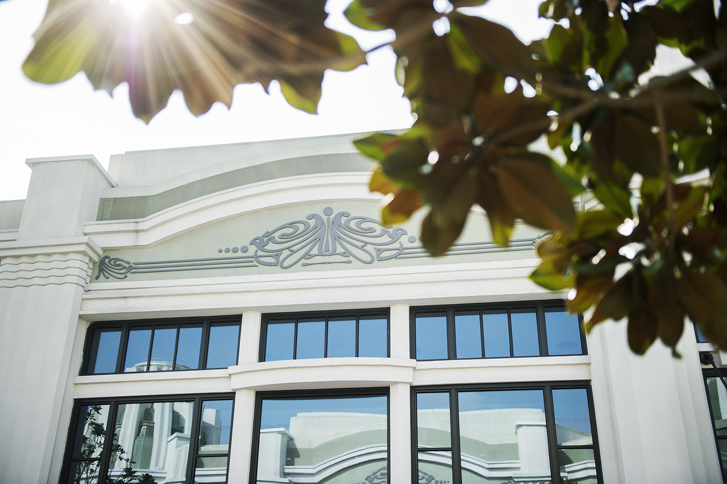
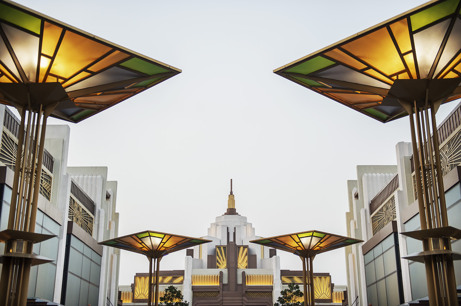
I think there's a nice example from our Shanghai project. We find the storytelling in Shanghai is a little bit different. There is a background story, but we are also using the project as a platform to have people experience the creative energy from the early part of the 20th century: the 1920s and '30s, which defines the aesthetic character of the project.
What we found was that, particularly in modern urban Chinese culture, there is a real desire to rapidly acquire knowledge about new experiences and products, and for our market, when it comes to global fashion trends and to be able to communicate that knowledge to their peers.
It becomes part of the social currency, particularly if you look at the luxury brand industry: everybody now can buy a pair of Prada shoes or a Hermès handbag. So how can you take that further? One way is to know the story behind Prada or Hermès, and to be able to tell a little bit about it. Did you know that Hermès started out as saddle-makers?
We do a lot of intercept interviews in our projects to understand what people like and what they don't like. In China, it's about self-expression: “I've come here to express myself by finding things I like to buy, to wear; I'd like to use those to define who I want to be because I'm trying to invent that.”
“We enable our guests to amass knowledge about things they haven’t encountered before, and attach that knowledge to the purchase. This is how the story connects the product to the experience. ”
For us, it also supports how people communicate about the experience they've had within our environment, encouraging repeat visits and new visitors.
Shanghai Village Architecture
Can you tell us more about the narrative behind the Shanghai project?
We took an approach similar to that of Fidenza as we were faced with a site with no obvious intrinsic narrative value. In this case, the site was within the estate where Disneyland Shanghai was being built. The site itself was a swampy, muddy land. There were piles of rubble from old factory buildings and workshops that had been demolished to make way for a 24-square kilometre recreational zone that would be anchored by the Disney development.
In our storyline, we were walking around this landscape, and we came upon one curious building, with an interesting curved facade. An old man approached us as we were trying to decipher the origin of the quirky façade. He told us the story about how, in the early part of the 20th century, when he was a boy, this had been an area for an expansive design exposition, with pavilions sponsored by various countries. The only building left standing was the one we were examining.
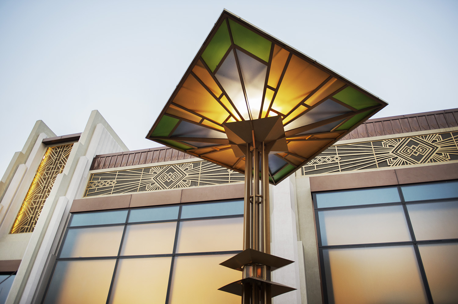
We went back, scratched our heads, and thought that what we should do is to create such an exposition, use this building as the inspiration — the “DNA” — for the overall project. And that's what we did. We studied expositions, world fairs and trade shows from the mid-19th century to the present day, with a focus on the famous Art Deco exposition held in Paris in 1925.
We took the story forward and said, how might such an exposition have come about in 1920s Shanghai? For the story, I created two protagonists. One was an Hungarian architect who had served in World War One, ended up in Russia, subsequently finding his way to Shanghai. The other was a young Chinese-American architect from New York who had come to Shanghai for a work and ended up getting taking a job in the municipal government.
We knew that the Shanghai government had, in fact, sent a delegation to see the Art Deco Expo in Paris. They might have said, "Shanghai should have its own design exposition to showcase international trends and to present Shanghai style to the world”. So in our story, the young Chinese architect was tasked with the conception of the project and enlisted the Hungarian designer to work with him. The European designer invited to Shanghai a coterie of creatives in various disciplines who were active at the time to help in its realisation.
The result is that our project is designed as a series of four radial rows and three concentric connecting roads. The radial roads were inspired by the great sources of creativity at that moment in history: New York, Paris, Milan and Vienna. We also wanted to celebrate the group of creatives - painters, architects, ceramicists, designers — who helped to inform this direction, so we named each of the streets after, for example, Hildreth Meiere and Edward Steichen, amongst others.
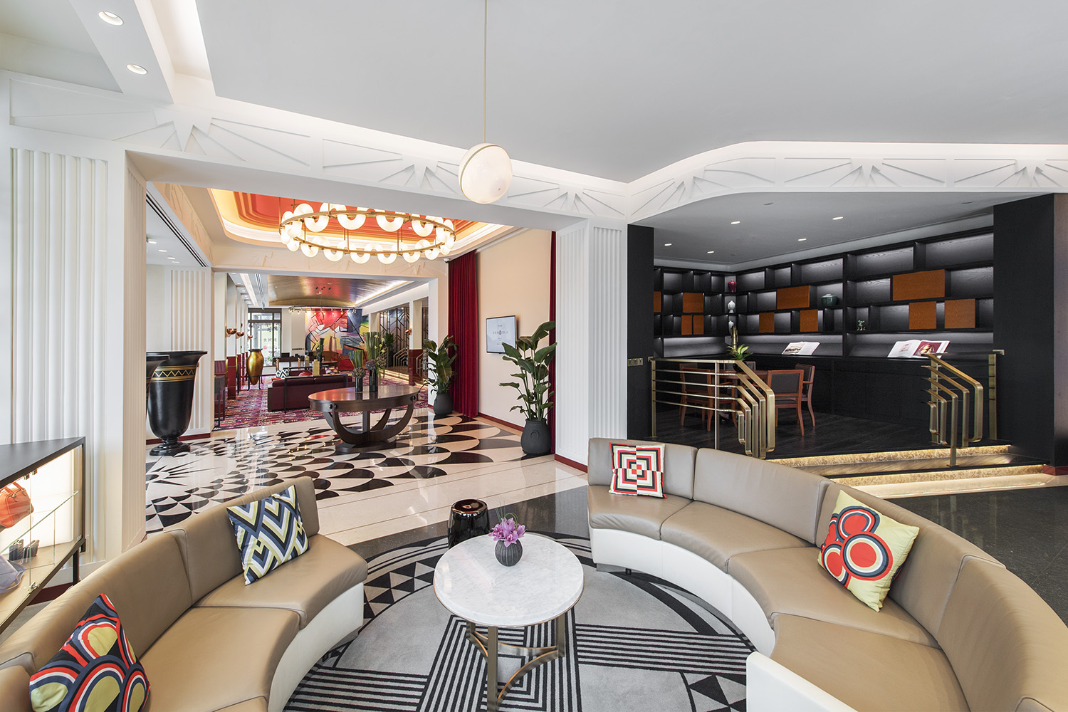
Shanghai Village — Art Deco inspired interiors
What about the interior design? Was it inspired by the same story?
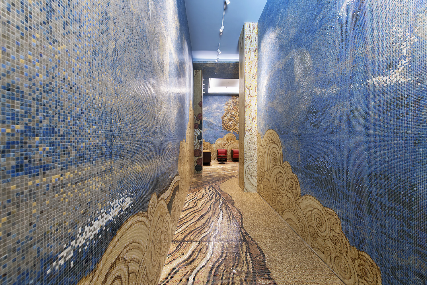
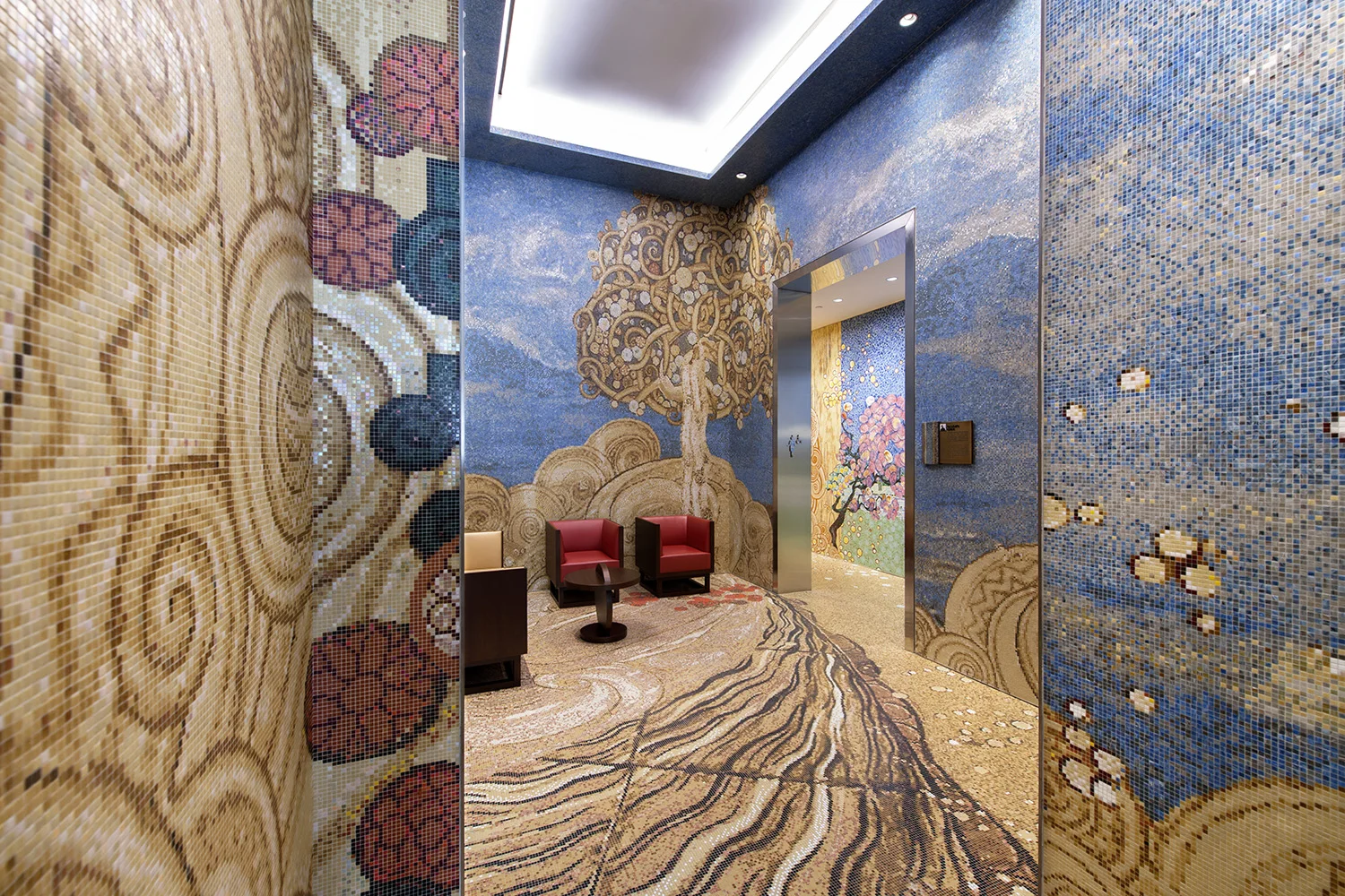
We had a lot of fun with the interior spaces. The idea we started exploring was, what would it be like to be inside a work of art? We worked with our illustrator, trying to articulate such an experience. We have seven pairs of public restrooms, and each one is inspired by an artist of the period. For example, we looked at the floral paintings of Georgia O'Keeffe and we created a three-dimensional experience of being inside one of her paintings. The entire installation is executed in handmade glass and ceramic tiles. Nothing is a copy; we're just inspired by it. Imagine walking into a painting!
We were also inspired by Galileo Chini, who is a ceramist and designer from Florence, as well as by Sonia Delaunay, Gustav Klimt and Giacomo Balla, one of the Italian Futurists and others.
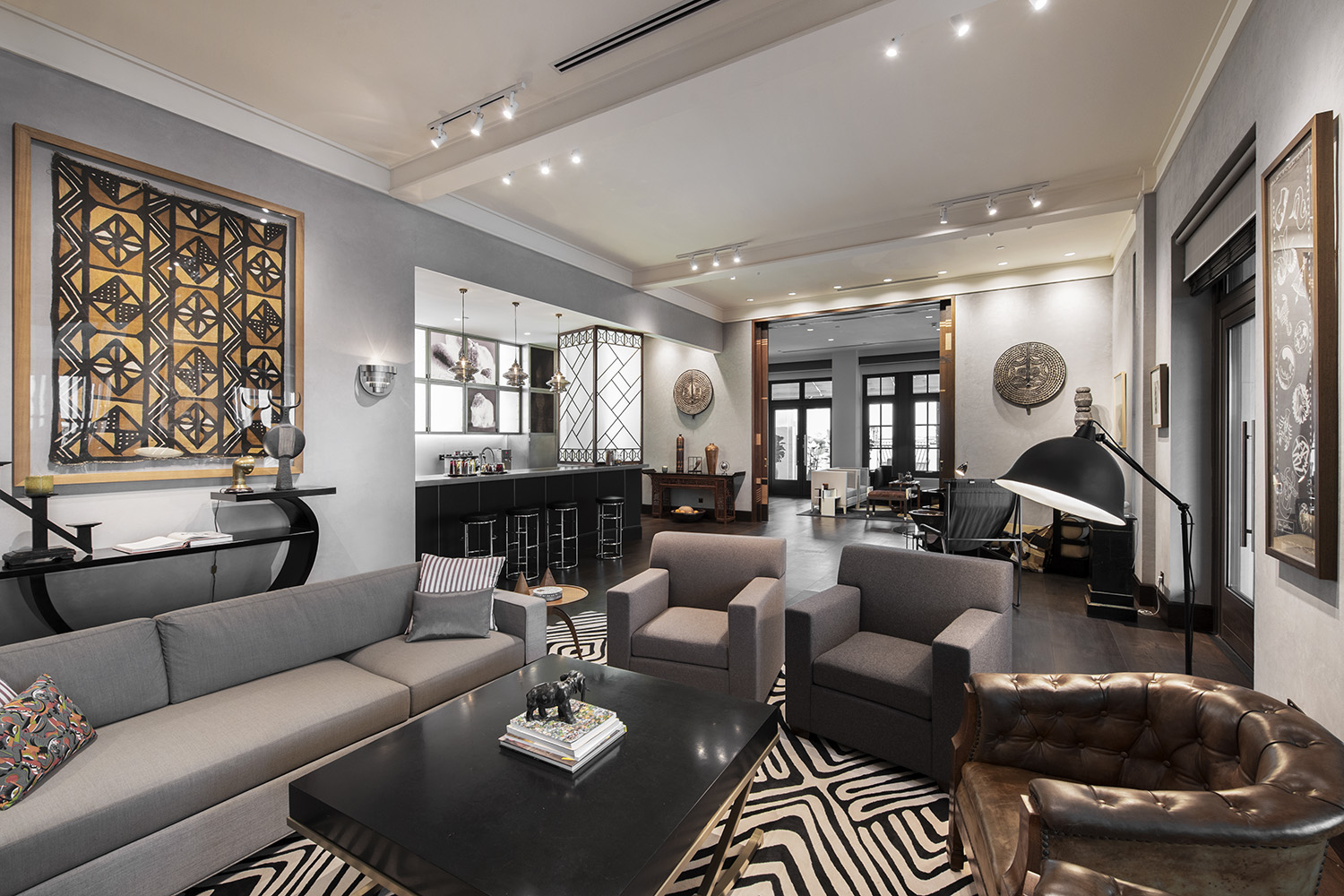
Our VIP lounge is inspired by Man Ray. We imagined a salon — either Man Ray’s studio or the salon of Man Ray's collector. It was really based on photographs I've seen of Man Ray’s studio in Los Angeles. He was sort of an amateur anthropologist, and he loved collecting sculptures from Africa and Oceania; his studio was filled with such work. Another lounge is inspired by Renee Lalique, and is meant to be evocative of cruise liner S.S. France for which he designed the interiors in the '20s.
It sounds like you have a lot more fun than most architects!
Focusing on the retail and experimental side of business allows you to do that. If you're doing designing buildings, you wouldn't really have that kind of latitude. It’s also the nature of the Value Retail organisation. It's led by creativity. We're always pushing the envelope and we're expected to do that.
What’s interesting about your creative approach is that you start with something authentic and then it becomes quite theatrical.
“I think retail is about theatre. Even more so as retail is evolving. ”
It's changing dramatically as we speak. You see the demise of department stores, particularly in the States. Macy's, who have been one of the stalwart department stores of the American retail tradition, are closing dozens of stores a year. That's all going to change; there's a definite transformation of the retail industry underway.
We see a future in aggregating small and emerging designers all over the world. That's going to become more important to those of us who are looking for authenticity and diversity, particularly the Millennial generation. They may have the spending power to buy Prada and Gucci; but there is a resistance to brands that are becoming commoditised, even at high price points. If you go to China, for example, where we do a lot of work, you'll see how ubiquitous global luxury brands have become.
So, we need something that's truly unique, that has a real story behind it. There's much more value in that. I was recently attending a conference on retail entertainment in LA, where one of the speakers referred to his young research associate spending $7 on a pair of jeans but $25 on a bottle of ketchup. The point is that a pair of jeans is a commodity product. But the bottle of ketchup, where the glass was a cool shape and the label is beautifully designed and the ketchup was handcrafted with unusual ingredients - there's a lot more value in that to this person.
“It’s about how people express themselves, how they want to be perceived by their own community. There’s a whole lot of storytelling behind that.”
That could happen with fashion as well. There's a lot of stories behind fashion, but those stories are not necessarily coming out of Prada and Gucci, they're coming out of some emerging designer in Oman, or in Detroit, or in Kunshan in China. We see that as the future of retail. In our business, that could represent 30 to 40% of the retail in our future projects.
If you had one piece of advice on how to really use narrative well in placemaking, what would it be?
To shoot as high as possible. It's a lot easier and more productive to think expansively, and then engineer down, than to start with a very low aspiration and try to inflate up.
It is all about imagination. I've been a big student of Walt Disney for many years. Disney is driven by creativity. Disneyland started out as basically a bunch of animators saying, "How do I take this or two-dimensional experience and make it a three-dimensional environment?" It’s about being expansive.
The other advice I’d have is trying to divine the spirit of the place. We've never tried to replicate. Find something that is evocative of that spirit. The spirit of place in Fidenza is music and food. That's what’s going to drive the design; how do you give that some three-dimensionality? It's about digging deeper into the culture than what's on the surface.


